


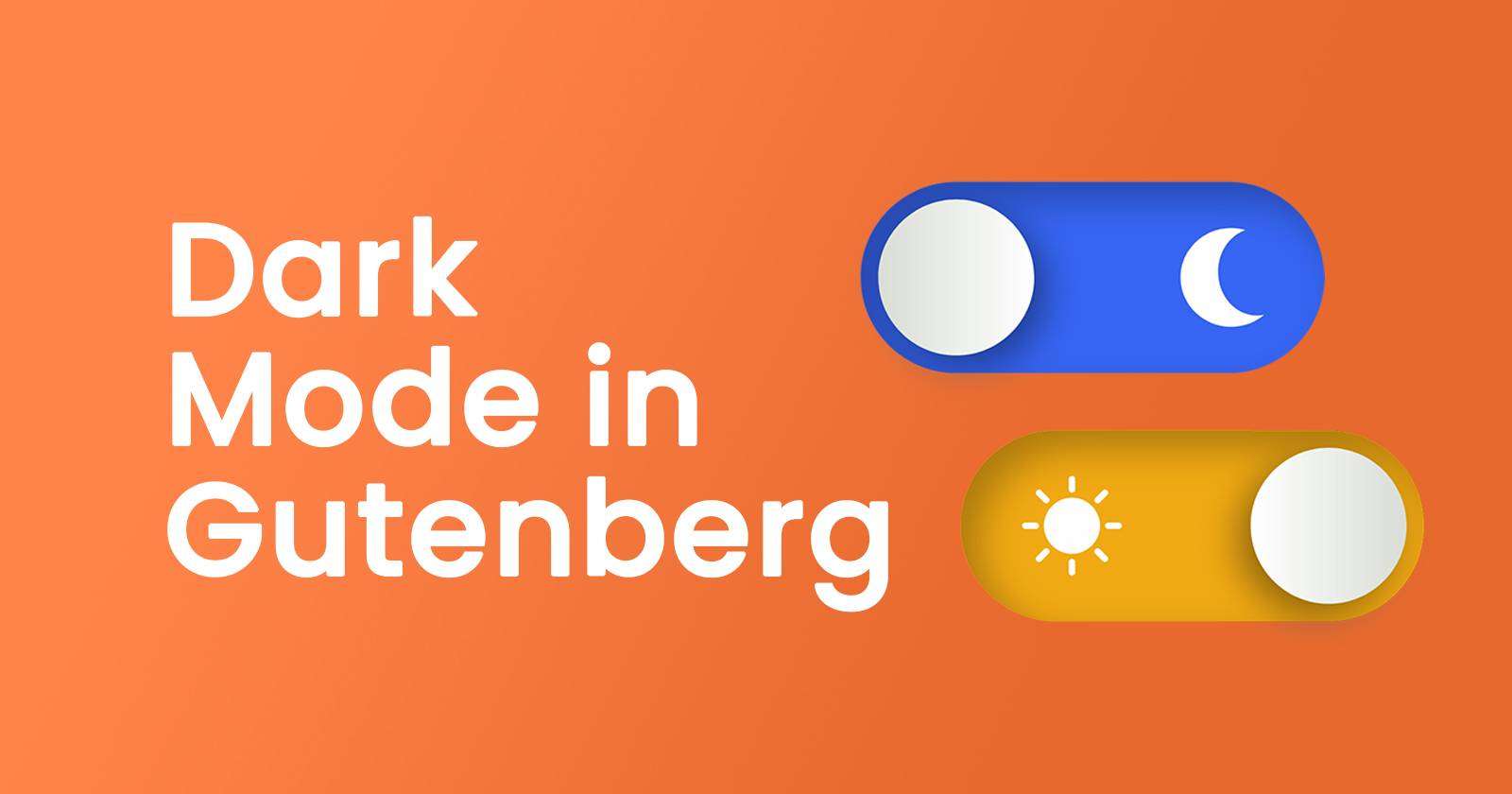
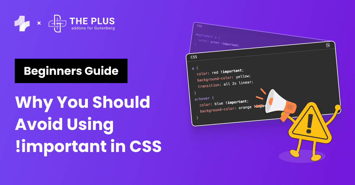
Are you tired of the blinding brightness while working on your WordPress website and wish to enable dark mode in Gutenberg block editor?
You’re in luck if you’ve been yearning for a sleeker and more eye-friendly editing experience.
In this comprehensive guide, we’re about to show you an incredibly easy method to enable Dark Mode in Gutenberg Block Editor.
Stay with us, and in just a few moments, you’ll be well on your way to enhancing your WordPress editing experience.
Let’s dive into the world of Dark Mode and discover how to activate it in the Gutenberg Block Editor.
Stay ahead of the curve with our exclusive insights and analysis on the latest WordPress trends and techniques - subscribe to our newsletter today.
What Is Dark Mode?
The dark mode is a trend in technology that has been growing in popularity and is set to remain a popular choice by many. This color scheme typically focuses on making the products and devices more engaging and accessible for everyone.
Often, a toggle button allows users to switch between a light and dark theme on their device.
When the switch button is clicked, the background of the screen becomes black, the text becomes white, and vice versa in the light mode.
Why Add Dark Mode To A Website?
When you use a bright and colorful interface, it can be difficult to concentrate and work on a project for hours.
As a result, the idea of implementing a Gutenberg dark mode became something that quickly grew in popularity.
The basic idea is to create an experience that is easier on the eyes.
There are many ways to achieve this effect, but one of the most popular methods has been to swap out white backgrounds for black or dark gray ones.
8 Important Dark Mode Practices
Today, while I was scrolling through Instagram, I found this insightful post on Dark Mode from Dmitriy Bunin (You can follow him for great UI/UX tips)
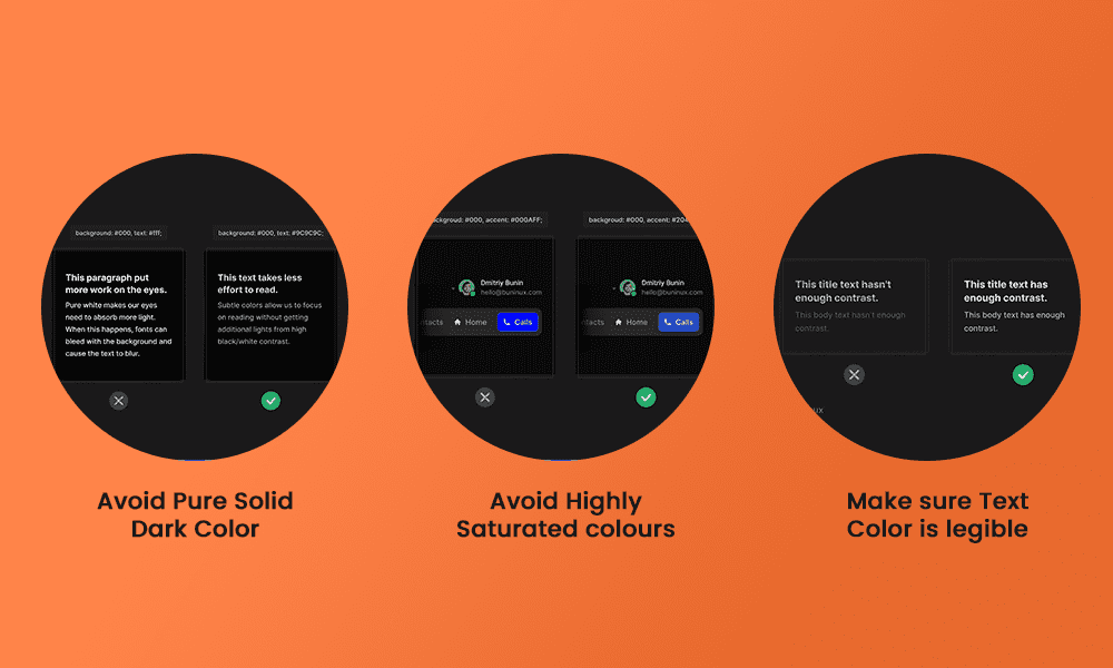
1) Avoid Pure Dark Colors – Never use a pure dark color such as HTML #000000 as WordPress block editor background color. This can add eye strain for your users, making it more uncomfortable to read your site content rather than less. Rather than using black, it is better to use dark gray to give the best appearance.
2) Avoid Highly Saturated Colors – High-saturated colors can be distracting and cause discomfort when scrolling through your site. To provide a better user experience, choose colors that are softer or with lesser color intensity.
3) Make Sure Text Color is Legible – Text plays a key role on your site, and to comply with W3C accessibility, use a bright, clear font and suitable colors so that the text shows up clearly against the dark background.
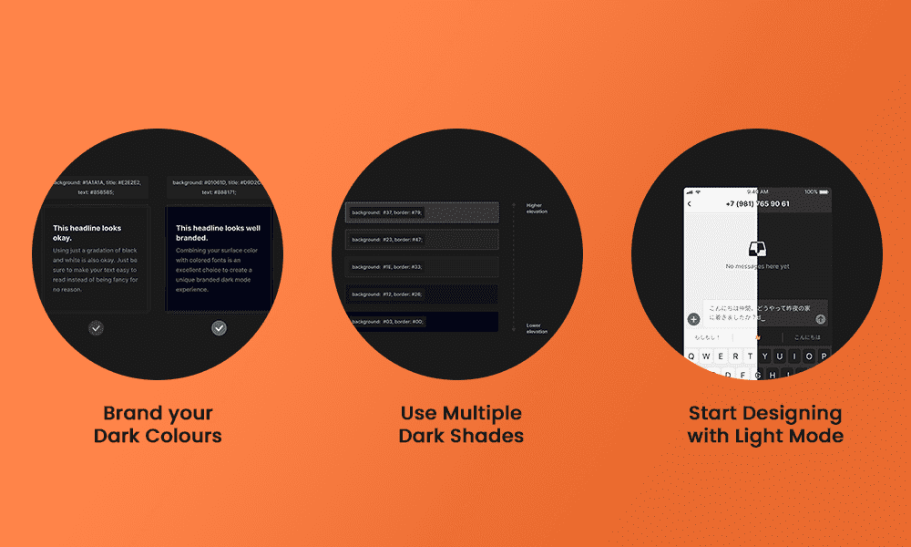
4) Brand your Dark Colors – Your normal brand colors may not work perfectly against the dark gray background offered by the Dark Mode, so think carefully about creating a version of your branding that does work, and make this become your brand identity within any Dark Mode.
5) Use Multiple Dark Shades – You can use a spectrum of color shades or opacities to create a sense of depth or hierarchy within your site. So having a top-level item highlighted with a lighter gray background color, decreasing in color or opacity as you work down the list, can help to break up what might otherwise be a large block of brighter color.
6) Start Designing with Light Mode – It’s always better to design Light Mode first so that you get your design style right, which you can then invert in your Dark Mode. Try to make sure that distant elements are shown as darker, while lighter shades can be used for elements that can be considered as nearer or in front of others.
This Instagram post has provided great value, which I thought would be helpful for anyone thinking about incorporating a Dark Mode on their website. Now let’s learn how to enable a Dark Mode on your Gutenberg site.
To achieve a Dark Mode on your site, we will use one of the most powerful Gutenberg Blocks – The Plus Blocks for Gutenberg Block Editor.
With more than unique 70+ Customizable blocks, you’ll get an easy-to-use Dark Mode block included.
You will need the Pro version to unlock the Dark Mode block (Get 85+ blocks at just $39), which works with any theme.
Looking for Elementor alternatives? Here’s a detailed comparison of 5 Best Elementor Page Builder Alternatives.
How to Enable Dark Mode for WordPress [Step-by-Step]
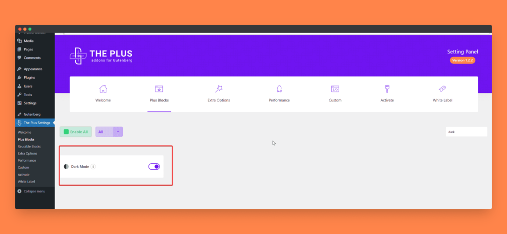
1) Turning On The Dark Mode Block From Dashboard
You’ll be pleased to know that you won’t need to strain your eyes in order to find the Dark Mode block in our huge block library.
Simply type ‘Dark Mode’ in the search bar, and you’ll see the block appear. This is a toggle switch, and when toggled to the ‘on’ position, it will activate the Dark Mode across your whole website.
2) Setting The Global Colors For Site-Wide Dark Mode/Light Mode Shades
The next step is to set our global color alternatives for the Dark Mode. By doing this, we will be able to embed the instructions in the Dark Mode toggle button to display the whole website in one of two completely different color schemes.
The advice I would give here is to use global colors for all site-wide elements, whether they are typographical or background colors.
Doing this makes the task of creating color presets for the DarkMode much easier.
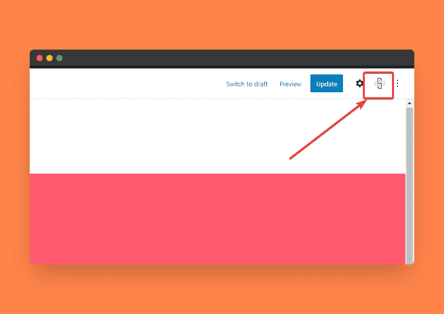
You will find the global colors setting, which looks like a plus symbol, in the top-right corner. This is called the Plus customizer.
Now, here you will see ‘Preset 1’, which is the default color shade you used on your site. This can also be called a light mode theme. This will be selected as the active selection, with a green check on the bar.
To add your WordPress dark mode alternatives for each of these shades, click on ‘Add Preset’, and to make it easier to identify, name this Dark Mode.
Now, before changing any color, click on the settings gear and click Dark Mode to set this as your switch’s alternative color.
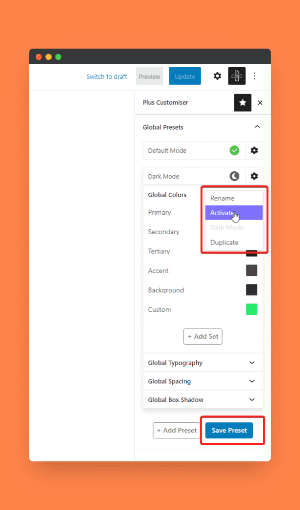
Let’s proceed with changing the colors. Please remember that in Dark Mode, we can only change the Global colors. The global box-shadow, global typography, and spacing won’t be affected.
Always keep the same number of shades in both the ‘Preset 1’ (or Light Mode) and the Dark Mode preset so that there’s an alternative for each one of them.
If you wish to keep them unaffected, keep the same color as Preset 1. Once done, click Save Preset, and we are ready to add the Dark Mode block to our site.
To show the Dark Mode option on a single page, add the block on just that individual page directly.
But to show this option site-wide, we have to place it in the header or footer of the site, where it will be positioned in one corner.
3) Editing The Dark Mode Block Settings
To begin with, search for the block as we did before, or type /darkmode to get the block and hit Enter.
After this, we will see the layout settings, which show multiple styles of the Dark Mode switch button. Currently, we have 3 unique styles of buttons available.
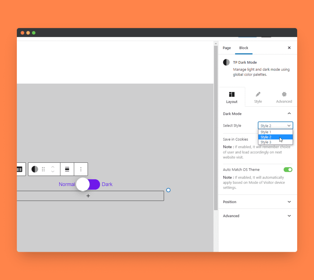
In addition to these three styles, you can upload custom icons for buttons in the Style 3 option and add a background image for the button.
The next setting is ‘Save in cookies’, and this determines whether the user’s selection of the Light or Dark Mode is stored locally on their machine, allowing the site to display using that option whenever they revisit your site automatically.
This makes the user experience easier, so they don’t have to change modes every time they visit your website.
Similarly, the ‘Auto Match OS Theme‘ does the magic of identifying the mode from the user’s mobile or desktop device preference and applies that mode automatically on your website.
Lastly, the position settings give you the control to set the positioning of the Dark Mode switch at any specific position on your website.
After working through these settings, you can move to the Style tab to customize the colors, font type, and size to help ensure the toggle switch matches your brand look and feel.
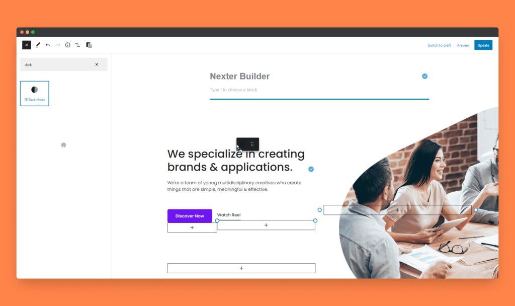
4) Setting Global Colors For Any Section Or Text In Dark Mode Colors
After all the above steps, we have to assign the correct global colors to other blocks on your site.
In our current example, we will change the background color of the TP Row block to select one of the global colors of Preset 1 or Light Mode.
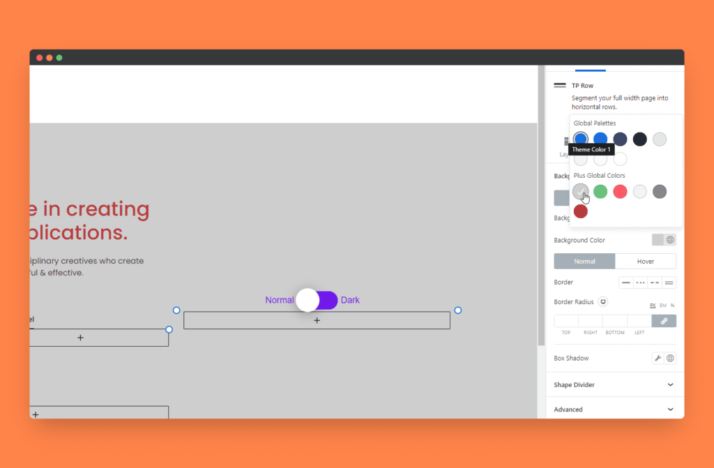
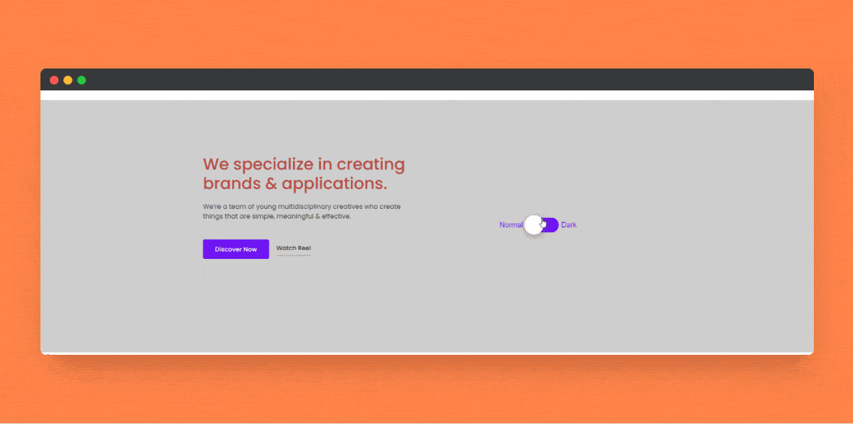
That’s all! After selecting this, when you click the toggle button, our color changes to the dark palette, as shown below.
Also Read: Learn How to Add Dark Mode to Elementor [the Easy Way] and make your website look more user-friendly.
Get our best WordPress tips, tricks, and tutorials delivered straight to your inbox - Subscribe to our Monthly Email newsletter Today.
End Note
Today, we learned how to add a premium Dark Mode theme to your WordPress site using its default block editor, Gutenberg. If you wish, you can do the same thing on Elementor by checking this tutorial on enabling dark mode in Elementor.
I hope this adds immense value to your site’s look and feel. If you have any questions or suggestions, feel free to share in the comments below or reach us through live chat in the bottom right corner.
Further Read: Want to create a WordPress website for free? Check this 6-step guide on Creating a WordPress Website for Free.