


WordPress is an incredibly powerful platform when used correctly, can help you better reach and engage your audience. One of the most effective ways to do this is through the use of a WordPress popup. Popups are an incredibly versatile tool that can be used to increase website conversions, drive newsletter signups, generate more sales, promote special offers and more.
But how do you create a WordPress popup?
Well, there are many plugins available that you can use to create popups in WordPress. But, the Popup Builder block from The Plus Blocks for Gutenberg is specifically created for the WordPress/Gutenberg block editor, which offers many powerful features to create dynamic popups in WordPress.
Required Setup
- Make sure the default WordPress Block editor is active.
- You need to have The Plus Blocks for Gutenberg plugin installed and activated.
- This is a premium block, you need the PRO version of The Plus Blocks for Gutenberg.
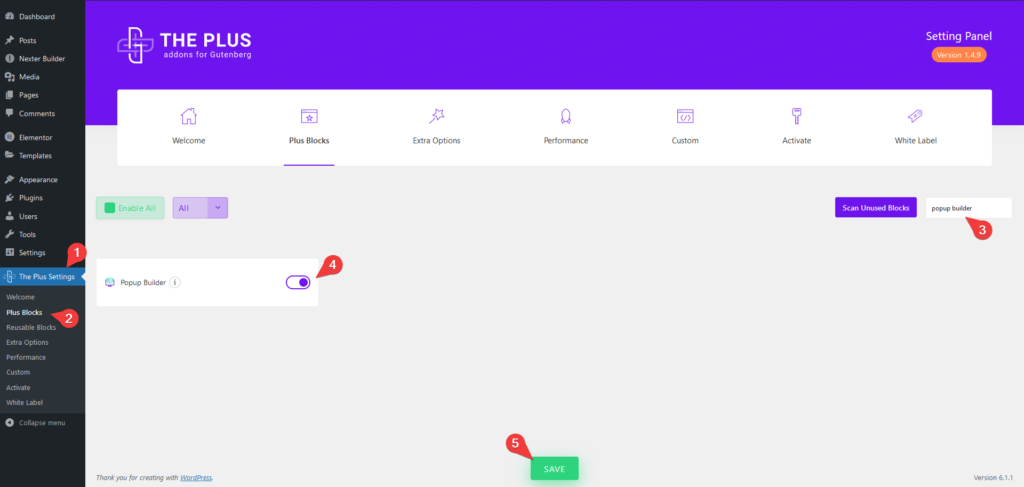
- Make sure the Popup Builder block is activated, to verify this visit Plus Settings → and Search for Popup Builder and activate.
Learn via Video Tutorial:
How to activate the Popup Builder/Off Canvas Block?
Go to
- The Plus Settings → Plus blocks
- Search the block name and turn on the toggle then click Save.
Key Features
- Create different types of popups – You can create different types of popups like Standard Popup, Slide Popup, Push Content Popup, Slide Along Content Popup and Corner Box Popup.
- Multiple ways to add content – You can add content in multiple ways using Reusable Block, Content, Editor or Shortcode.
- Multiple popup trigger elements– You can use a button or icon as the popup trigger element or hide the trigger altogether as well.
- Different ways to close the popup – You can use different options to close the popup.
- Fixed Toggle Button – You can easily place the popup trigger element anywhere on the page.
- Show Menu Scroll Offset – Show the popup trigger button on scroll.
- Multiple display conditions – You can add different display conditions on your popup to make it dynamic.
How to add Popup Builder Block on WordPress websites?
There are multiple ways you can add the Popup Builder block or any other block in the WordPress block editor.
Click on the + icon at the top left of the editor or the + icon in the editor and search for the name of the block or widget, for instance, Popup Builder Block, then click on the block to add to the page.
Or you can type / (forward slash) in the editor and type the name of the block, and then click on it to add.
This way you can add a Popup Builder block or any other Gutenberg block.
Note: If you want to show the popup on all the pages of your website, then you should add the Popup Builder block in the header or the footer template of your website.
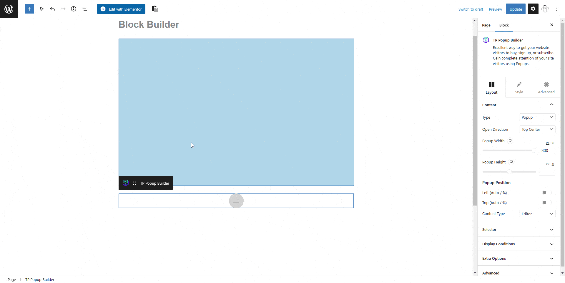
How to add content in the WordPress Popup Builder?
Once you add the Popup Builder block on the page, first, you have to choose the type of popup you want from the Type dropdown.
Under this, you’ll find five types of popups –
Popup – For creating standard popups.
Slide – For creating sliding popups, this popup option can be used for creating an off canvas popup menu.
Push Content – In this type of popup, the popup will push the content while opening and closing.
Slide Along Content – This option will slide the content along with the popup, creating a very similar effect to the Push Content popups.
Corner Box – For creating small popups at the corner of your page.
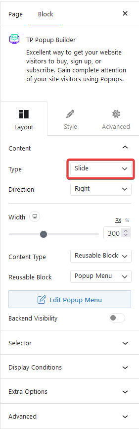
Depending on the type of popup, you’ll find relevant popup settings for open direction, size etc.
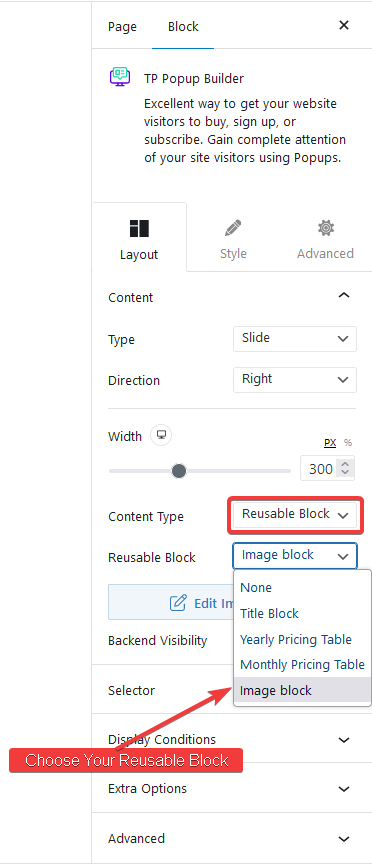
For the content of the popup, you’ll find multiple options under the Content Type dropdown.
- Reusable Block
- Content
- Editor
- Shortcode
Reusable Block
This is an extremely powerful way to add content to the popup, as you can use the WordPress block editor to design your popup content using other blocks. Giving many possibilities to create unique layouts for your popups, like showing images, videos, products, newsletter signup forms etc.
So to use the Reusable blocks, you have to create and save a Reusable block first, then choose Reusable Block from the Content Type dropdown.
After that, from the Reusable Block dropdown choose your reusable block.
You can also click on the + Create Reusable Block button to create a reusable block.
After choosing the Reusable block, you will see a Backend Visibility toggle option, this is turned off by default to offer a better editing experience. You can turn it on to see your block in the backend once done it is advisable to turn it off.
Note: You have to click on the popup trigger button to view the popup content.
Content
In this option, you can directly write the content in the editor. This is suitable if you want to use only text in your popups.
Editor
This option is equally powerful as the Reusable Block option, as you can use the WordPress/Gutenberg editor to create the popup layout.
To use the editor option, select Editor from the Content Type dropdown. Now to access the editor, you have to click on the popup trigger element on the page (in the backend) then it will show the content and there you can change it.
Shortcode
With this option you can use shortcodes to display content in your popup. Using this method you can show different forms inside your popups as well.
Once you’ve added the content to your popup you have to choose the popup trigger element from the Selector tab.
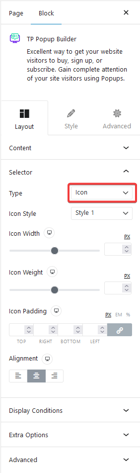
Under the Type dropdown, you’ll find three trigger options –
Button – This option will add a button to the page that users can click to open the popup.
Icon – You can use an icon as the popup trigger element. You can use this option to create a popup menu.
Hidden – This will hide the trigger element, this is useful if you want to show your popup on various display conditions without any user interactions like showing the popup on page load.
Depending on the trigger options, you’ll get relevant customisation options.
How to set Display Conditions for Popup in WordPress?
If you manage a WordPress website, you know how important it is to ensure you provide a website experience that is both intuitive and user-friendly. One way to do this is to set up display conditions for popups on your website.
Popups are a great way to direct your visitors to the information you want them to see without overwhelming them with content. But without proper display conditions, your popups can become intrusive and annoying.
The Popup Builder provides many display conditions that you can use to decide when and where the popup will be displayed.
You’ll find all the display conditions under the Display Conditions tab and we have covered a dedicated doc on each one of them so that you can understand them in depth.
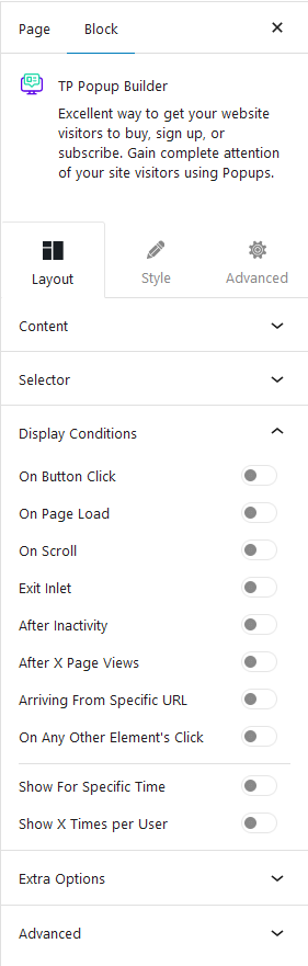
- On Button Click
- On Page Load
- On Scroll
- Exit Inlet
- After Inactivity
- After X Page Views
- Arriving From Specific URL
- On Any Other Element’s Click
- Show For Specific Time
- Show X Times per User
Extra Options
Then you’ll find some options under the Extra options tab –
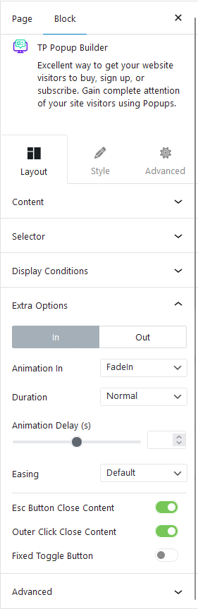
Popup In/Out Animation – If you choose Popup as your popup type, then you’ll see this option, from here, you can control the popup in and out animation.
Esc Button Close Content – This option allows users to close the popup by pressing the Esc key. Learn more about the process.
Outer Click Close Content – This option will close the popup when someone clicks outside the popup.
Fixed Toggle Button – This will allow you to put your toggle button or the popup trigger element in a fixed position on the page. You can easily customise its position for different devices and add a scrolling effect to the button by using the Show Menu Scroll Offset option.
How to style Popup/OffCanvas in WordPress?
If you want to style your popup to match a certain theme you can do that from the Style tab.
Content Area – From this tab, you can manage the popup padding, background etc.
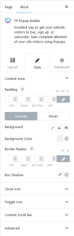
Close Icon – From here you can control the style of the popup close button and popup overlay. You can even hide the popup close button from here.
Toggle Button – If you’ve chosen Button as your popup trigger element, you’ll see this option in the Style tab. From here you can make the button full width, and adjust its padding, typography, text colour, background, border etc.
Toggle Icon – This option will be available if you choose Icon as the popup trigger element, from here you can manage the icon colour, background etc.
Content Scrolling Bar – Form here you can even control the styling of the popup scroll bar. You’ll find separate styling options for different parts of the scroll bar.
Advanced – This is our global extension available for all our blocks. From here you can add a custom CSS class in the Additional CSS class(es) field. If you know CSS you can use this class to further finetune the style by using your own custom CSS.
Advanced options remain common for all our blocks, you can explore all it options from here.