


When you want to show two pieces of content where users can easily toggle between them to compare, like comparing different plans/offers, pricing tables etc. you can use the Switcher block.
Create some amazing content toggle sections on your website by using the unique features of The Plus Blocks for Gutenberg Switcher Block.
Required Setup
- Make sure the default WordPress Block editor is active.
- You need to have The Plus Blocks for Gutenberg plugin installed and activated.
- This is a Premium block, you need the PRO version of The Plus Blocks for Gutenberg.
- Make sure the Swither block is activated, to verify this visit Plus Settings → and Search for Switcher and activate.
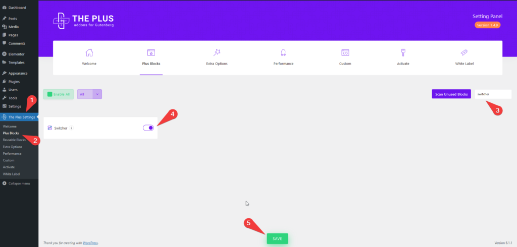
How to activate the Switcher WordPress Blocks?
Go to
- The Plus Settings → Plus blocks
- Search the block name and turn on the toggle then click Save.
Key Features
- Multiple content sources – Multiple options to add content in the Switcher block, Content, Editor and Reusable Block.
- Add dynamic content in Switcher – Make your Switcher content dynamic using the dynamic fields.
- Multiple Switcher style – Four different Switcher styles to choose from.
- Show/hide Switcher Toggle – Easily show hide the Switcher toggle button.
- Add icon to Switcher label – You can easily add icons to the Switcher label.
- Connection ID – Control the Switcher block with a Carousel Remote block using the Connection ID feature.
How to add Switcher Button on WordPress websites?
There are multiple ways you can add a Switcher block or any other block in the WordPress block editor.
Click on the + icon at the top left of the editor or the + icon in the editor and search for the name of the block or widget, for instance, Switcher Block, then click on the block to add to the page.
Or you can type / (forward slash) in the editor and type the name of the block and then click on it to add.
This way you can add a Switcher block or any other Gutenberg block.
How to add flip content to WordPress Switcher block?
The Plus Blocks for Gutenberg Switcher block offers multiple options to add content.
Add the Switcher block on the page, now you will see two sections Content 1 and Content 2 whatever you add to these two sections the switcher will toggle between them.
So open the Content 1 tab, in the Title field you can either type the title or you can use a dynamic field to generate the title dynamically.
To create a dynamic title click on the cylindrical icon at the end of the title field and choose the desired field from the dropdown.
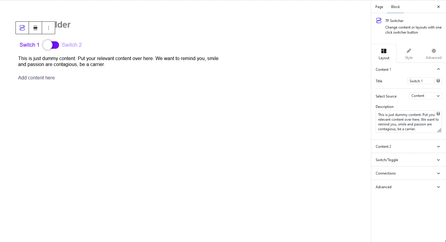
After choosing the field you will see a toggle for Advanced Settings, which you can turn on to add a prefix, postfix and fallback text.
Note: Wherever you see that cylindrical icon within The Plus Blocks for Gutenberg blocks you can use the dynamic fields.
Now for the content of the Switcher, you will find three options in the Select Source dropdown Content, Editor and Reusable Block.
In the Content option, you can write the content directly, you can even use shortcodes or you can use the dynamic fields to add the content dynamically.
The Editor option gives you more flexibility and power to use unique content in the Switcher, as you can use any blocks like pricing table, image, gallery etc. to create your content using the default WordPress Block editor.
Keep in mind if you are using the Editor option for both the content sections then you have to click on the toggle button of the Switcher to add content in both sections.
The last option is Reusable Block, in this method you have to create the layout first using the block builder and save it as a reusable block, then you have to select the block from the dropdown list.
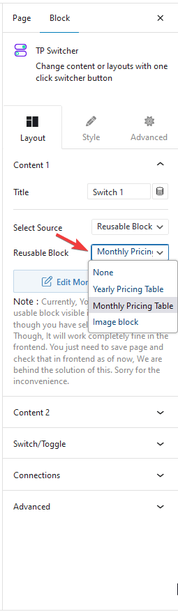
With this option too you can use any block to create unique layouts and content for the Switcher.
To learn more about the process, click here.
Switch/Toggle Settings
You can further improve your Switcher by using these additional options.
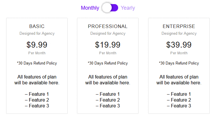
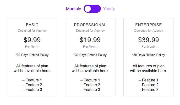
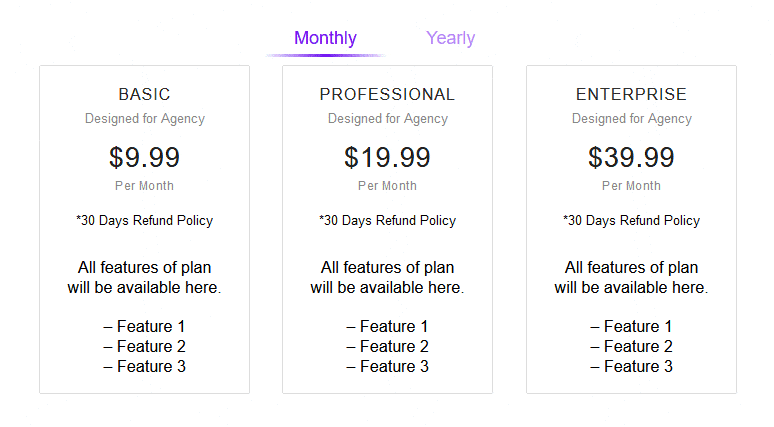
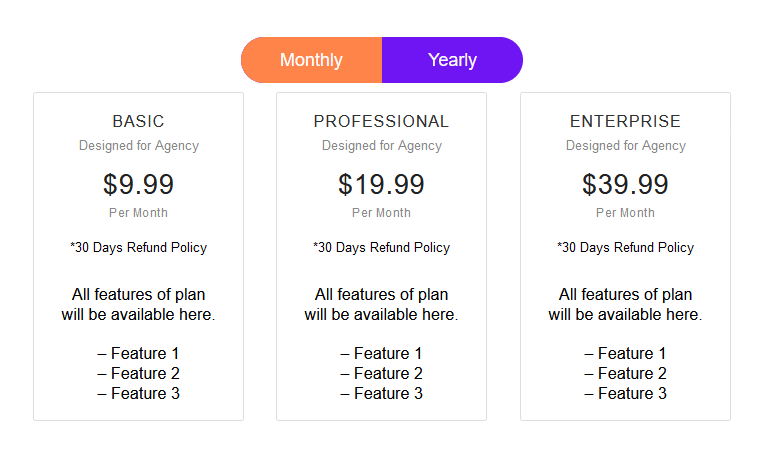
Switcher Style – There are 4 different styles for the Switcher Toggle to choose from.
Style 1
Style 2
Style 3
Style 4
Display Switcher Button – If needed you can easily hide the Switcher toggle button, you can use this feature when using a Carousel Remote widget as the Switcher controller.
Alignment – Easily align the Switcher left, right or center.
Label Spacing – You can adjust the Switcher label spacing from the Switcher toggle button.
Switch/Toggle Size – Form here you can easily control the Switcher toggle size.
How to add icons to Switcher block in WordPress?
With The Plus Blocks for Gutenberg Switcher block, you can even add icons to the Switcher labels.
Go to Switch/Toggle > Label Icon and turn on the toggle.
Now you will see options to add icons for both labels, use the icon library to add the icons.
Connections
Using the Connection ID you can control your Switcher block with a Carousel Remote block from any part of the page. Learn more about the process from here.
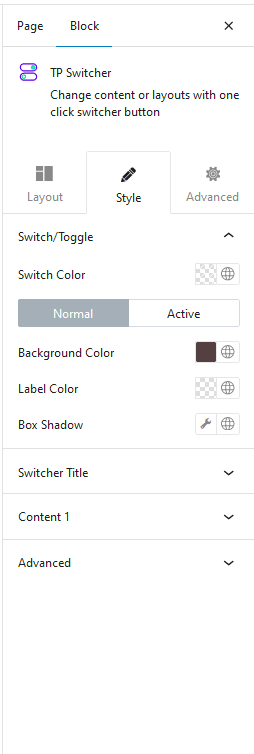
How to style Switcher Block in WordPress?
You will find all the styling options under the Style tab to style your Switcher block.
Switch/Toggle – From here you can style the Switcher toggle button and the label the way you want. It has all the necessary styling options like switch colour, background colour for both normal and active state, label colour etc.
Switcher Title – You can manage the switcher label typography and icon size and colour from here.
Content – If you are using Content in any of your switcher content you will see this styling option related to that section only and you can manage their typography and colour from here.
As for the Editor and Reusable Block options, you can manage all the styling using the block editor itself.
Advanced – This is our global extension available for all our blocks. From here you can add a custom CSS class in the Additional CSS class(es) field. If you know CSS you can use this class to further finetune the style by using your own custom CSS.
Advanced options remain common for all our blocks, you can explore all it options from here.