When you have a large piece of information that you want to divide into multiple sections, you can use the Tabs block and split them into different tabs, making it easier for users to get the information.
The Plus Blocks for Gutenberg Tabs Tours block is one such block that can allow you to create unique Tab content for your website.
Required Setup
- Make sure the default WordPress Block editor is active.
- You need to have The Plus Blocks for Gutenberg plugin installed and activated.
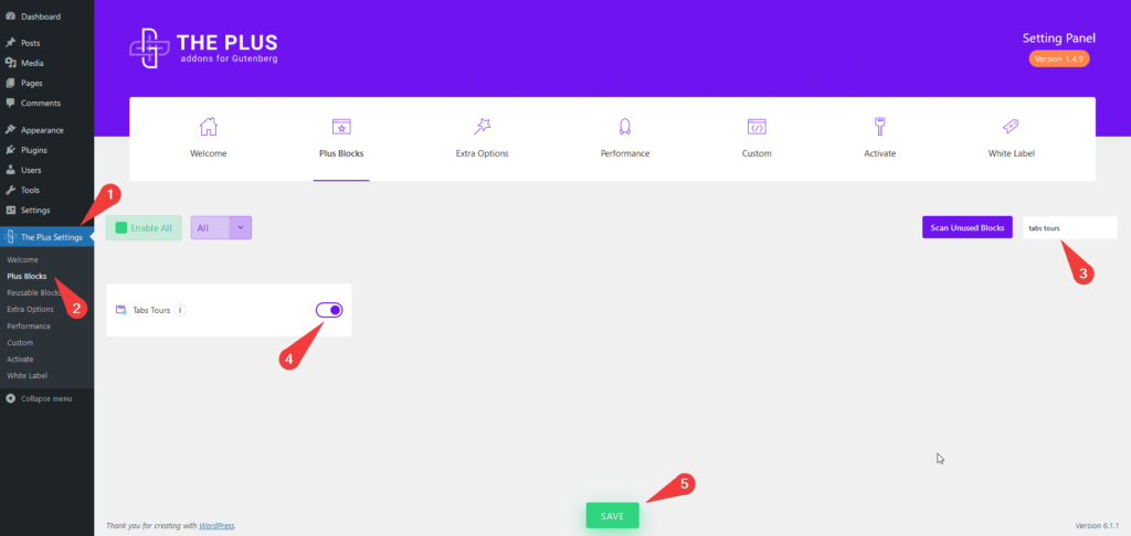
- Make sure the Tabs Tours block is activated, to verify this visit Plus Settings → and Search for Tabs Tours and activate.
- This is a Freemium block to unlock the extra features, you need the PRO version of The Plus Blocks for Gutenberg.
How to activate the Tabs/Tours Blocks?
Go to
- The Plus Settings → Plus blocks
- Search the block name and turn on the toggle then click Save.

Key Features
- Multiple content sources – You can use three different ways to add content in your tabs, Content (Free), Editor (Free) and Reusable Block (Pro).
- Add dynamic content in tabs (Pro) – You can show dynamic content like post titles, post excerpts etc.in your tabs.
- Show icons in tabs (Free) – You can easily add different icons for your tab titles.
- Additional outer icon (Pro) – If you want, you can show an additional outer icon for tab titles.
- Unique ID (Pro) – You can link directly to a tab item using the Unique Id.
- Multiple layouts for tabs (Free) – You can choose from a Horizontal or Vertical layout.
- Adjust tab title position (Free) – You can easily adjust the tab title position.
- Add swipe effect (Pro) – Easily add a swipe effect to the horizontal tab titles for easy navigation.
- Default Active Tab (Pro) – Assign any specific tab to be an active tab by default.
- Tab Type (Pro) – You can either make your tabs open on click or on hover.
- Carousel Connection ID (Pro) – Create a connection between Tabs and Carousel Anything to create interactive layouts.
How to add Tabs on WordPress websites?
There are multiple ways you can add a Tabs block or any other block in the WordPress block editor.
Click on the + icon at the top left of the editor or the + icon in the editor and search for the name of the block or widget, for instance, Tabs Tours Block, then click on the block to add to the page.
Or you can type / (forward slash) in the editor and type the name of the block and then click on it to add.
This way, you can add a Tabs block or any other Gutenberg block.
How to add content in WordPress Tabs block?
With The Plus Blocks for Gutenberg Tabs Tours block, you’ll find multiple ways to add content to your tabs.
First, add the Tabs block on the page and go to the tab item you want to add the content in.
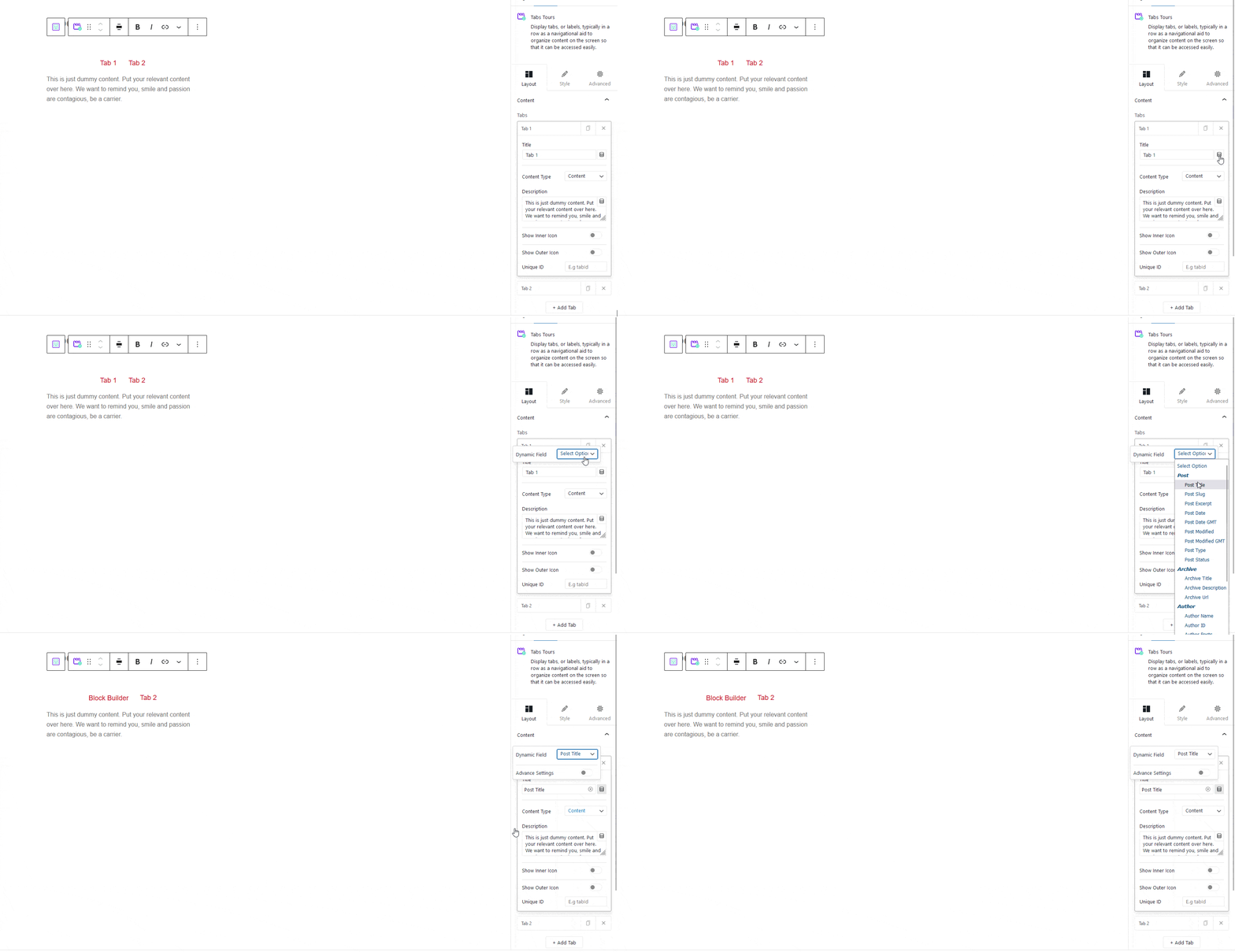
In the Title field, you can directly write the title or you can add dynamic content like post title, author name etc. as the title.
To add a dynamic title, click on the cylindrical icon at the end of the title field and choose the desired field from the dropdown.

After choosing the field, you will see a toggle for Advanced Settings, which you can turn on to add a prefix, postfix and fallback text.
Note: Wherever you see that cylindrical icon within The Plus Blocks for Gutenberg blocks you can use the dynamic fields.
For the Tab content, you will see three options under the Content Type dropdown, Content (Free), Editor (Free) and Reusable Block (Pro).
In the Content option, you can write the content directly, use shortcodes, or use the dynamic fields to add the content dynamically.
With the Editor option selected, you can directly use all the features of the default WordPress block editor inside the tab content area.
This opens up a window of opportunity to create unique layouts using different blocks like image, gallery, form, blog posts, etc., making it a very powerful option.
Lastly, you can use Reusable Blocks as the content source. For this, you have to create the reusable first and then choose it from the dropdown list.

This too, is a very powerful option, as you can create unique layouts with different blocks using the block editor.
To learn more about the process, click here.
After choosing the Reusable block, you will see a Backend Visibility toggle option, this is turned off by default to offer a better editing experience. You can turn it on to see your block in the backend. Once done it is advisable to turn it off.
Then you will see a couple of options to add icons to the Tab title. Learn more about the process.
In the end, you will see a field for Unique ID. You can use this field to directly link to a Tab item, mostly used with vertical tabs. This way, you can send users directly to a specific tab.
Finally, you can click on the + Add Tab button to add more tabs.
Layout for Tabs – Top, Bottom Left and Right
You will get different layout options with The Plus Blocks for Gutenberg Tabs Tours block to give your Tabs a unique look.
- Layout – You can choose from a Horizontal or Vertical layout for your tab.
- Navigation Position – For horizontal layout, you can place the tab navigation at the top or bottom and for vertical layout, left or right.
- Nav Alignment – You can also align the tab titles within the navigation bar for horizontal tabs.
Powerful Extra options
These extra options make this Tabs block truly unique. We have covered a dedicated doc on each one of them so that you can understand them in depth.
How to style Tabs Block in WordPress?
To give your tabs a unique look and feel, you can use the various styling option located under the Style tab.
Tab Title Bar (Free) – To style the tab title use this tab. From here, you can manage the typography, colour, title visibility. nav alignment, nav width (pro), nav equal width (pro) etc.

Tab Title Bar Background (Free) – From this tab, you can manage the style of individual tab title backgrounds, such as background, border, space between tabs, margin, padding etc.
Main Icon (Free) – You can style the main icon of your tab title from here. Apart from all the necessary styling options from here, you can also make the icons full-width to place them above the title.
Outer Icon (Pro) – Control the styling of the outer or the additional icons of the tab titles from here. You will find settings for icon size, colour, active colour, spacing and visibility options for mobile.
Navigation Area Background (Free) – From this tab, you can control the total tab navigation area background style with options like padding, margin, background, border etc.
Content (Free) – This tab is for styling the tab content typography and colour.
Content Background (Free) – Style the tab content area background from this tab and control its padding, margin, background, border etc.
Responsive Options (Pro) – Under this tab, you will find additional options to style the tab titles for mobile devices. Under the Tab Navigation Responsive dropdown, you will find three extra options-
- Full width: You can use this option if you have a small number of tabs so that it can take up the full-screen width of the mobile.
- One by one: With this option, your tab title will be placed one after another vertically. You can adjust their spacing as well.
- Force Accordion: You can even convert your tabs into accordions for mobile users. You’ll also find all the styling options for the accordion.
Advanced – This is our global extension available for all our blocks. From here you can add a custom CSS class in the Additional CSS class(es) field. If you know CSS you can use this class to further finetune the style by using your own custom CSS.
Advanced options remain common for all our blocks, you can explore all it options from here.


