


Are you looking for a simple and effective way to showcase your team members on your WordPress website? Highlighting your team can not only enhance credibility and trust but also add a sense of belonging among team members.
The Team Member block from The Plus Blocks for Gutenberg, is a powerful tool that allows you to showcase your team members on your website in a visually appealing and organised manner.
Required Setup
- Make sure the default WordPress Block editor is active.
- You need to have The Plus Blocks for Gutenberg plugin installed and activated.
- This is a premium block you need the PRO version of The Plus Blocks for Gutenberg.
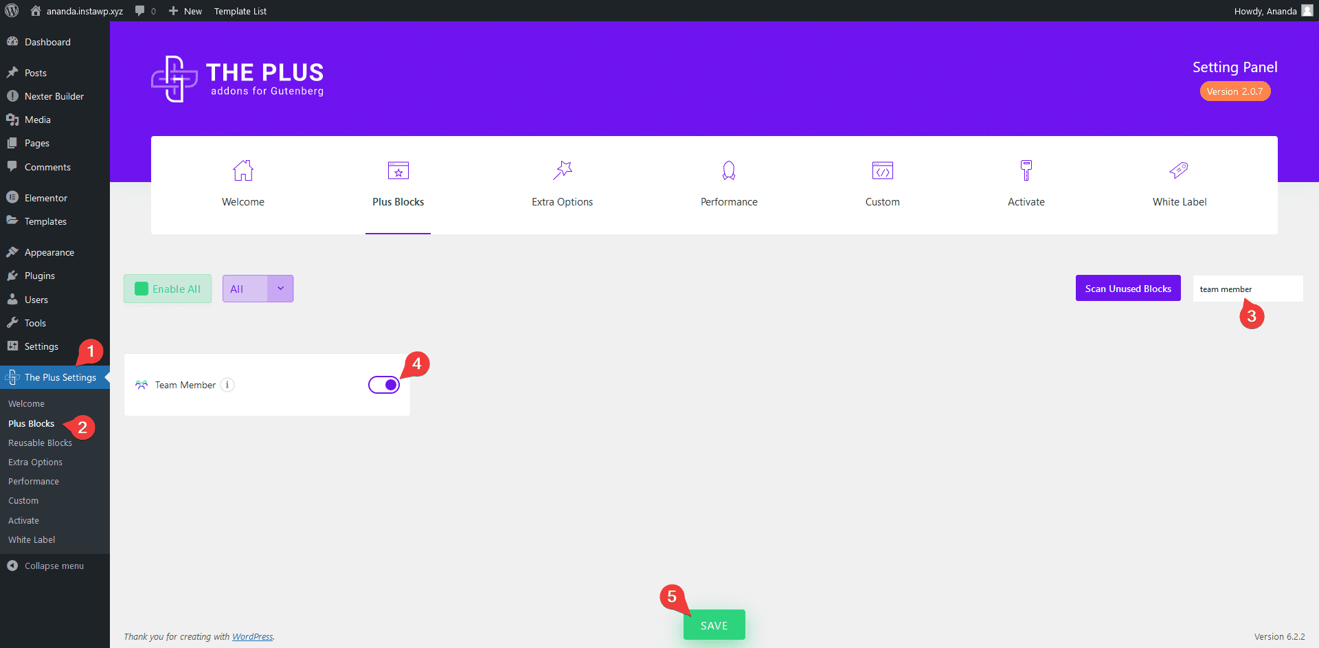
- Make sure the Team Member block is activated, to verify this visit Plus Settings → and Search for Team Member and activate.
How to Activate the Team Member Block?
Go to
- The Plus Settings → Plus blocks
- Search the block name and turn on the toggle, then click Save.
Key Features
- Multiple Style Options – You can choose from multiple styling options.
- 3 Layouts – You can choose from three layout types Grid, Masonry, and Carousel.
- Category Filter – You can easily add category filters to your member listing (except for the carousel layout).
How to Create Team Member Listing in WordPress?
Add the Team Member block on the page to create a team member listing.
Content Layout
From the Style section under the Content Layout tab, you can select from different predefined styles.
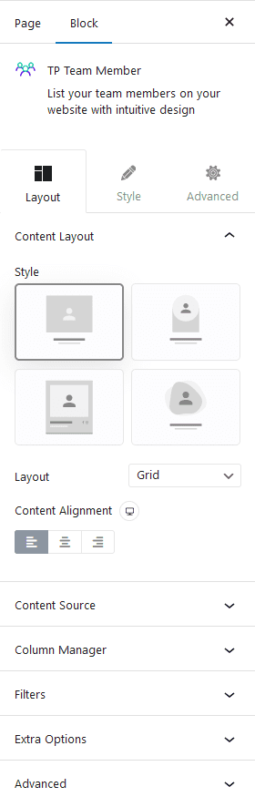
Then from the Layout dropdown, you can select the layout of your team member listing. Here you’ll find three options –
Grid – For creating a grid layout.
Masonry – For creating a masonry grid layout.
Carousel – For creating a team member carousel slider.
Select the appropriate layout option which fits your need.
From the Content Alignment section, you can align the text content of the listing.
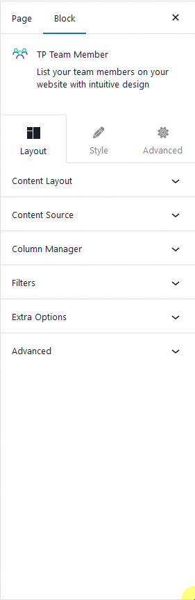
Content Source
In the Content Source tab, you’ll find a Team Members section. From here, you can directly add the content, open the first item.
Name – Here, you have to add the member name.
Upload Image – Here, you have to add the member image.
Designation – Here, you have to add the designation of the member.
Category (Separated by comma) – Here, you can manually create a category and add the member to it. This can be used to filter team members by categories.
Note: You can add multiple categories separated by a comma (,).
Single Page Url – Here, you can add a page URL showing the full profile of the member.
Website – Here, you can add the member’s personal website URL.
Facebook Link – Here, you can add the member’s Facebook profile URL.
Email Link – Here, you can add the member’s email id.
Instagram Link – Here, you can add the member’s Instagram profile URL.
Twitter Link – Here, you can add the member’s Twitter account URL.
Linkedin Link – Here, you can add the member’s Linkedin profile URL.
Telephone – Here, you can add the member’s phone number.
Click on the +Add Team Member button to add multiple members.
Columns Manager
From the Columns Manage tab, you can manage the number of columns of your member listing for different devices.
You can also manage the column gap from here.
Filters
From this tab, you can add a beautiful category filter to the member listing.
Note: Filters option is not available in the Carousel layout.
Extra Options
Then, in the Extra Options tab, you’ll find some additional options.
Title Tag – You can set different HTML tags to your team member listing title from here.
Display Designation – From here, you can show and hide the member’s designation.
Display Social Icon – From here, you can show or hide the member listing social icons.
Disable Link – From here, you can disable the single page link from the member list item.
Image Size – From here, you can select different image sizes of the member listing image.
How to Style the Team Member Block?
To style the Team Member block, you’ll find all the styling options under the Style tab.
Title – From here, you can manage the team member listing title typography and colour.
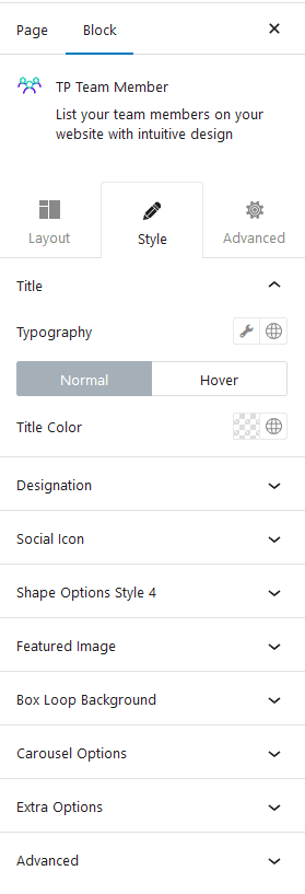
Designation – From here, you can manage the team member listing designation typography and colour.
Social Icon – From here, you can manage the social icon size, width, icon colour, background, border etc.
Shape Options Style 4 – You’ll see this option if you use style 4 for your listing. From here, you can add the mask image (in PNG) for the listing image, you can also add an image to add an extra layer effect. You can add different animation effects to the image as well.
Featured Image – From here, you can manage the team member listing image’s inner background colour, margin, padding, overlay background colour etc.
Filter Category – If you’ve enabled Category Wise Filter then you’ll see this option. From here, you can manage the filter padding, margin, colour and filter counter’s colour, background etc.
Box Loop Background – From here, you can add padding, border, background, box shadow etc. to each item in the listing.
Carousel Options – This option will be visible when you use the Carousel layout. Here you’ll find many options to control the carousel.
- Slider Mode – From here, you can choose your slider orientation, horizontal or vertical.
- Slide Speed – Control your slide transition speed from here.
- Active Slide – From here, you can select any slide to be the active slide when the page loads.
- Next Previous – You can set the behaviour of your next/previous slide movement from here. You can move one column at a time or all visible columns.
- Columns Gap – From here, you can adjust the gap of your slider.
- Draggable – Make your carousel draggable or non-draggable from here.
- Infinite Mode – From here, you can turn your carousel into an infinite loop slider.
- Pause On Hover – Allow the users to pause the slider on mouse hover.
- Autoplay – Make your carousel slider autoplay from here and adjust its speed.
- Show Dots – From here, you can add dots slider navigation and you can style them as well.
- Show Arrow – You can also add arrows navigation for your carousel slider and style them from here.
- Center Mode – From here, you can highlight the center slide by adding padding, scale effect or opacity.
- Wheel Navigation – With this option, you can navigate the slider with your mouse wheel.
- Keyboard Navigation – With this option, you can navigate the slider with your keyboard.
- Auto Scroll – With this option, you can make the slider auto scroll.
Note: For Auto scroll to work, make sure to disable Autoplay. This feature only works in the front end, you won’t see any preview in the backend.
Extra Options – From here, you can make a unique column alignment. Turn on the Messy Columns toggle you’ll get options to move columns up and down up to 6 columns individually for different devices.
Advanced – This is our global extension available for all our blocks. From here you can add a custom CSS class in the Additional CSS class(es) field. If you know CSS you can use this class to further finetune the style by using your own custom CSS.
Advanced options remain common for all our blocks, you can explore all it options from here.