


Are you looking for a way to showcase testimonials on your WordPress website? Testimonials are valuable for any business or organisation as they provide social proof and build trust with potential customers.
The Testimonials block from The Plus Blocks for Gutenberg, is a powerful tool that allows you to showcase testimonials on your website in a visually appealing and organised manner.
Required Setup
- Make sure the default WordPress Block editor is active.
- You need to have The Plus Blocks for Gutenberg plugin installed and activated.
- Make sure the Testimonials block is activated, to verify this visit Plus Settings → and Search for Testimonials and activate.
- This is a Freemium block, to unlock the extra features, you need the PRO version of The Plus Blocks for Gutenberg.
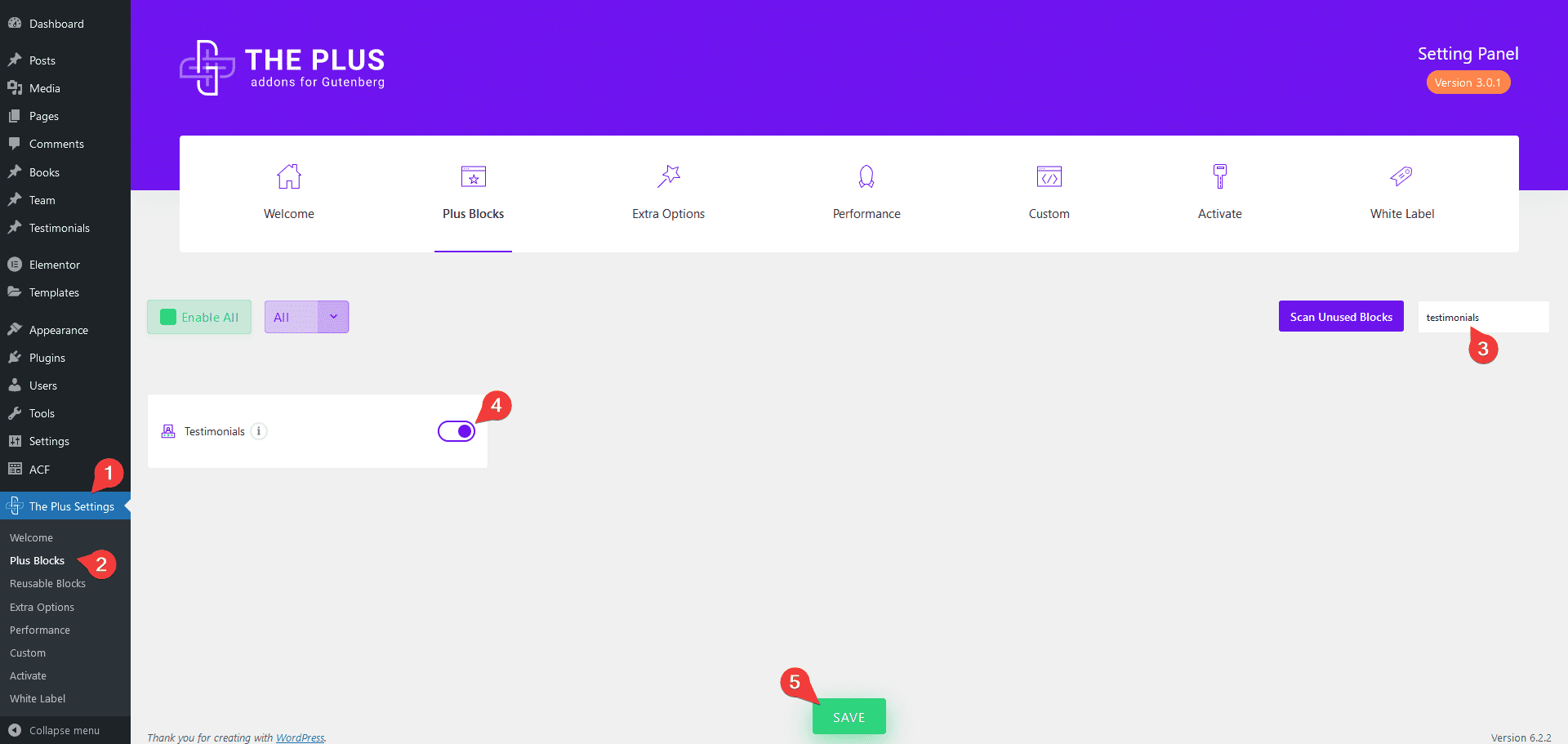
How to Activate the Testimonials Block?
Go to
- The Plus Settings → Plus blocks
- Search the block name and turn on the toggle, then click Save.
Key Features
- Multiple Style Options (Freemium) – You can choose from multiple styling options.
- 3 Layouts – You can choose from three layout types Grid, Masonry, and Carousel.
- Unique Carousel ID (Pro) – With the Unique Carousel ID, you can easily connect and control the testimonial carousel with the Carousel Remote block.
How to add Testimonials Reviews in WordPress?
To add a testimonial, add the Testimonials block on the page.
Content Layout
From the Style section under the Content Layout tab, you can select from different predefined styles.
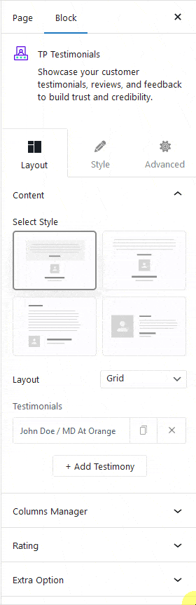
Then from the Layout dropdown, you can select the layout for your testimonials. Here you’ll find three options –
Grid – For creating a grid layout.
Masonry – For creating a masonry grid layout.
Carousel – For creating a testimonial carousel slider.
Select the appropriate layout option which fits your need.
From the Testimonials section, you can add content. Open the first item.
Author Title – Here, you can add the testimonial author’s name.
Author Designation – Here, you can add the testimonial author designation.
Testimonial Content – Here, you have to add the testimonial content.
Testimonial Title – Here, you can add a title for the testimonial.
Author Image – Here, you can add the testimonial author image.
Click on the +Add Testimonial button to add more testimonials.
Columns Manager
From the Columns Manage tab, you can manage the number of columns of your testimonial listing for different devices.
You can also manage the column gap from here.
Rating
From here, you can add a star rating to the testimonial. Learn more.
Connection
This option is only available for the Carousel type layout. From here, you can connect and control the testimonial carousel with the Carousel Remote block.
Extra Options
Then, in the Extra Options tab, you’ll find some additional options.
Content Height – From here, you can set a height for the testimonial content for different devices.
Title Height – From here, you can set a height for the testimonial title for different devices.
Content Scroll – From here, you can set the scroll bar behaviour if the content exceeds the height. You can show it on mouse hover or keep it visible always.
Excerpt Limit – This option is available for the Masonry type layout. From here you limit the content by text or word.
Content Limit By – This option is available for the Carousel type layout. From here, you can limit the testimonial carousel content by height, or you can limit the testimonial carousel content by text.
How to Style the Testimonials Block?
To style the Testimonials block, you’ll find all the styling options under the Style tab.
Author Title – From here, you can manage the testimonial author name typography and colour.
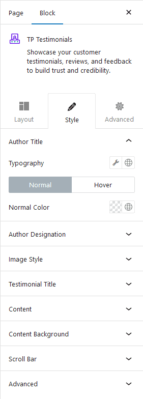
Author Designation – From here, you can manage the testimonial author’s designation typography and colour.
Image Style – From here, you can manage the testimonial author’s image width, border radius and box shadow for both normal and hover states.
Testimonial Title – From here, you can manage the testimonial title typography and colour.
Content – From here, you can manage the testimonial content typography and colour.
Content Background – From here, you can add padding, margin, background, box shadow etc. to each testimonial item.
Scroll Bar – From here, you can manage the scrollbar styling.
Carousel Options – This option will be visible when you use the Carousel layout. Here you’ll find many options to control the carousel.
- Slider Mode – From here, you can choose your slider orientation, horizontal or vertical.
- Slide Speed – Control your slide transition speed from here.
- Active Slide – From here, you can select any slide to be the active slide when the page loads.
- Next Previous – You can set the behaviour of your next/previous slide movement from here. You can move one column at a time or all visible columns.
- Columns Gap – From here, you can adjust the gap of your slider.
- Draggable – Make your carousel draggable or non-draggable from here.
- Infinite Mode – From here, you can turn your carousel into an infinite loop slider.
- Pause On Hover – Allow the users to pause the slider on mouse hover.
- Autoplay – Make your carousel slider autoplay from here and adjust its speed.
- Show Dots – From here, you can add dots slider navigation and you can style them as well.
- Show Arrow – You can also add arrows navigation for your carousel slider and style them from here.
- Center Mode – From here, you can highlight the center slide by adding padding, scale effect or opacity.
- Wheel Navigation – With this option, you can navigate the slider with your mouse wheel.
- Keyboard Navigation – With this option, you can navigate the slider with your keyboard.
- Auto Scroll – With this option, you can make the slider auto scroll.
Note: For Auto scroll to work, make sure to disable Autoplay. This feature only works in the front end, you won’t see any preview in the backend.
Extra Options – From here, you can make a unique column alignment. Turn on the Messy Columns toggle you’ll get options to move columns up and down up to 6 columns individually for different devices.
Advanced – This is our global extension available for all our blocks. From here you can add a custom CSS class in the Additional CSS class(es) field. If you know CSS you can use this class to further finetune the style by using your own custom CSS.
Advanced options remain common for all our blocks, you can explore all it options from here.