


One important aspect of creating mobile optimised WordPress websites is having mobile responsive tables to fit different screen sizes. With more and more users accessing websites through their mobile devices, it is imperative to ensure that your website is optimised for mobile viewing. Tables that are not mobile responsive can lead to a poor user experience, as they may appear distorted or may not fit on smaller screens.
Fortunately, with the Data Table block from The Plus Blocks for Gutenberg, you get two options to make your tables mobile responsive quickly.
To check the complete feature overview documentation of The Plus Blocks for Gutenberg Data Table block, click here.
Requirement – This block is a part of The Plus Blocks for Gutenberg, make sure its installed & activated to enjoy all its powers.
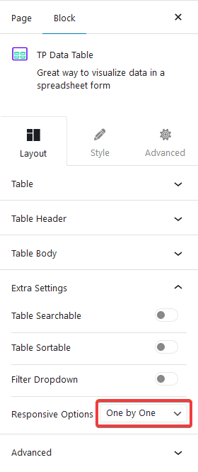
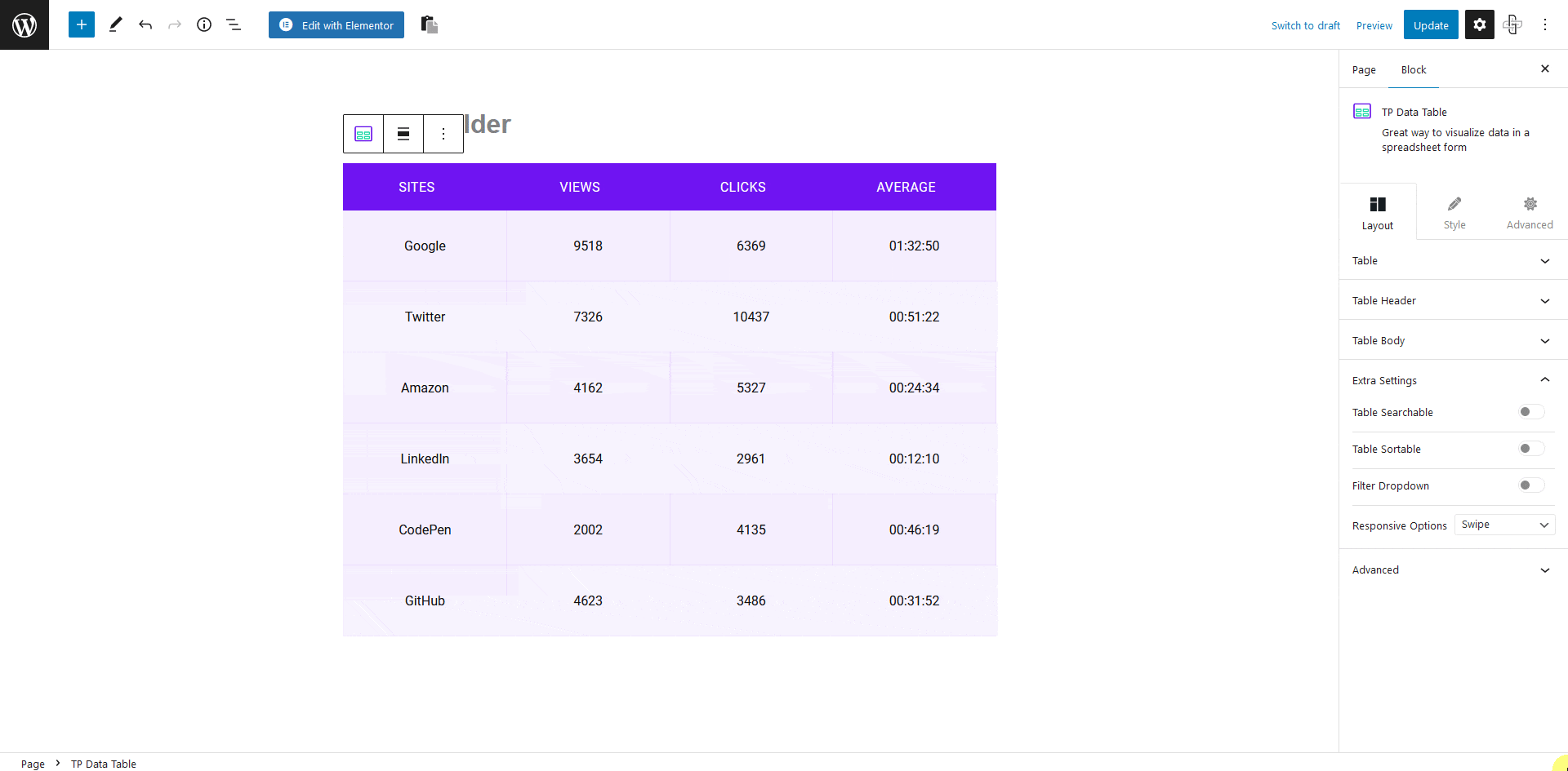
To do this, add the block on the page, once you’ve added content in your table go to the Extra Settings tab > Responsive Options.
Here, you’ll find two options in the dropdown –
Swipe – This option will add a horizontal scroll bar to the table, so users can easily swipe to see the content.
One by One – This option will re-structure the table for mobile to show the content one after another.
You can select any one option as per your preference.
Note: For small to medium data sets, the One by One Responsive option is advisable.
Now you can make mobile responsive tables in your WordPress website.
Also, check How to Import Data From CSV in WordPress Table.