


Are you looking to create a visually appealing media gallery on your WordPress website? Media galleries are a great way to showcase your visual content, such as photos or video files, in an organised and attractive manner.
The Media Listing block from The Plus Blocks for Gutenberg, is a powerful tool that allows you to showcase your media items, such as images and videos, in a visually appealing manner.
Required Setup
- Make sure the default WordPress Block editor is active.
- You need to have The Plus Blocks for Gutenberg plugin installed and activated.
- This is a premium block you need the PRO version of The Plus Blocks for Gutenberg.
- Make sure the Media Listing block is activated, to verify this visit Plus Settings → and Search for Media Listing and activate.
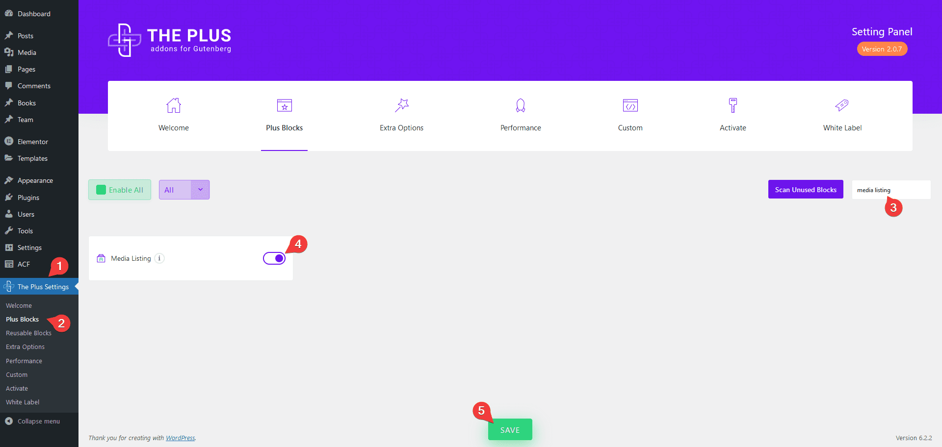
How to Activate the Media Listing Block?
Go to
- The Plus Settings → Plus blocks
- Search the block name and turn on the toggle, then click Save.
Key Features
- Multiple Media type – You can create image or video gallery.
- Multiple Source Types – You can choose from two source types for the image gallery Normal and Repeater.
- Multiple Style Options – You can choose from multiple styling options.
- 4 Layouts – You can choose from four layout types Grid, Masonry, Metro and Carousel.
- Box Link – You can easily link gallery items to external links.
- Category Filter – You can easily add category filters to your gallery listing (except for the carousel layout).
How to Create a WordPress Image Gallery?
To create an image gallery, add the Media Listing block on the page.
Layout
From the Type dropdown under the Layout tab, you have to select the gallery type. You’ll find two options –
Images – To create an image gallery.
Videos – To create a video gallery.
We’ll select Images.
From the Style section, you can select from different predefined styles.
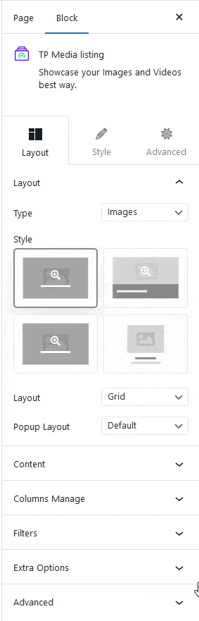
Then from the Layout dropdown, you can select the layout of your image gallery. You’ll find four options –
Grid – For creating a grid layout.
Masonry – For creating a masonry grid layout.
Metro – For creating a modern metro layout.
Carousel – For creating a carousel slider.
Select the appropriate layout option which fits your need.
In the Popup Layout dropdown, you can select the popup type. You’ll find two options –
Default – With this option, you can view all the gallery items in a popup slider.
No – With this option, gallery items will not open in a popup.
Content
From the Select Option dropdown under the Content tab, you have to select the source of the listing. Here you’ll find two options –
Normal – With this option, you can directly add images to the gallery
Repeater – With this option, you can add additional information like title, caption, category, custom URL and more while adding images to the repeater gallery. Learn more.
Here we’ll select the Normal option.
From the Upload Image section, you can add images to the gallery from the media library.
Columns Manager
From the Columns Manage tab, you can manage the number of columns of your image gallery for different devices.
You can also manage the column gap from here.
For the Metro layout, you can also select different styles for each device.
Filters
In the Repeater type gallery, you can create a gallery with a category filter.
Note: Filters option is not available in the Carousel layout.
Extra Options
Then, in the Extra Options tab, you’ll find some additional options.
Display Title – From here, you can show or hide the image/video title. You can also set different HTML tags to the title.
Display Image Size – From here, you can select different image sizes.
Display Content – From here, you can show or hide the image/video caption in the gallery.
Box Link – From here, you can make the entire image/video item clickable. You can also link image/video items to external links from here.
Note: Make sure to select No from the Popup Layout dropdown under the Layout tab to make the links work.
How to Style the Media Listing Block?
To style the Media Listing block, you’ll find all the styling options under the Style tab.
Popup Icon – From here, you can enable or disable the icon on the image/video. You can also set the icon or image for the gallery images/videos, besides that, you can manage icon size, colour, space etc.
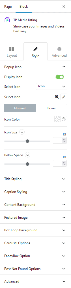
Extra Icon – You’ll see this option for the Repeater type gallery. From here, you can manage the extra icon size, colour, top and bottom space.
Title Styling – From here, you can manage the gallery title typography, colour, top and bottom space.
Content Styling – From here, you can manage the gallery text caption typography, colour, top and bottom space.
Content Background – From here, you can manage the image/video content background for normal and hover states.
Featured Image – From here, you can manage the image/video overlay background for normal and hover states.
Filter Category – If you’ve enabled Category Wise Filter then you’ll see this option. From here, you can manage the filter padding, margin, colour and filter counter’s colour, background etc.
Box Loop Background Style – From here, you can add border and box shadow to each item in the listing.
Carousel Options – This option will be visible when you use the Carousel layout. Here you’ll find many options to control the carousel.
- Slider Mode – From here, you can choose your slider orientation, horizontal or vertical.
- Slide Speed – Control your slide transition speed from here.
- Active Slide – From here, you can select any slide to be the active slide when the page loads.
- Next Previous – You can set the behaviour of your next/previous slide movement from here. You can move one column at a time or all visible columns.
- Columns Gap – From here, you can adjust the gap of your slider.
- Draggable – Make your carousel draggable or non-draggable from here.
- Infinite Mode – From here, you can turn your carousel into an infinite loop slider.
- Pause On Hover – Allow the users to pause the slider on mouse hover.
- Autoplay – Make your carousel slider autoplay from here and adjust its speed.
- Show Dots – From here, you can add dots slider navigation and you can style them as well.
- Show Arrow – You can also add arrows navigation for your carousel slider and style them from here.
- Center Mode – From here, you can highlight the center slide by adding padding, scale effect or opacity.
- Wheel Navigation – With this option, you can navigate the slider with your mouse wheel.
- Keyboard Navigation – With this option, you can navigate the slider with your keyboard.
- Auto Scroll – With this option, you can make the slider auto scroll.
Note: For Auto scroll to work, make sure to disable Autoplay. This feature only works in the front end, you won’t see any preview in the backend.
FancyBox Option – You’ll see this option when Popup Layout is set to Default, from here you can add different interactive buttons (share, slideshow, zoom etc.), navigation arrow, image counter, transition effect, animation effect etc. in the lightbox popup.
Post Not Found Options – From here, you can style the “Please select a multiple images gallery” message. You can manage the message typography, colour, background, border, padding etc.
Advanced – This is our global extension available for all our blocks. From here you can add a custom CSS class in the Additional CSS class(es) field. If you know CSS you can use this class to further finetune the style by using your own custom CSS.
Advanced options remain common for all our blocks, you can explore all it options from here.