


Are you looking to showcase your WooCommerce products in a beautiful and organized manner? A visually appealing product listing can captivate visitors, encouraging them to explore your store further and increasing the likelihood of making a purchase.
With the Product Listing block from The Plus Blocks for Gutenberg, you can show your WooCommerce products in various engaging layouts.
Required Setup
- Make sure the default WordPress Block editor is active.
- WooCommerce Plugin installed & activated.
- You need to have The Plus Blocks for Gutenberg plugin installed and activated.
- This is a premium feature, you need the PRO version of The Plus Blocks for Gutenberg.
- Make sure the Product Listing block is activated, to verify this visit Plus Settings → and Search for Product Listing and activate.
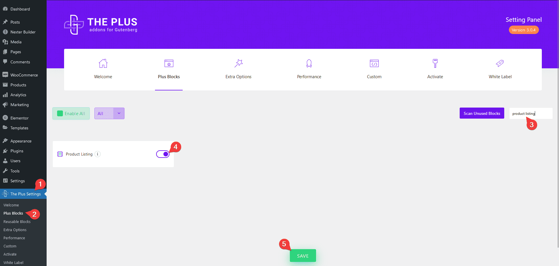
How to Activate the Product Listing Block?
Go to
- The Plus Settings → Plus blocks
- Search the block name and turn on the toggle then click Save.
Key Features
- Multiple Content Layout Types – You can choose from multiple content layout types. Normal Page, Archive Page and Single Page Related Products.
- Multiple Style Options – You can choose from multiple pre-defined styles.
- 4 Layouts – You can choose from four layout types Grid, Masonry, Metro and Carousel.
- Show Products by Category and Tag – You can easily show products by category and tag.
- Include and Exclude by Product Id – You can include and exclude products by product id.
- Offset Posts – You can easily hide products from the beginning of the listing by setting an offset number.
- Arrange Products by Different Parameters – You can arrange products by different parameters like id, date, author, title and more.
- Show Products by Different Status – You can show products based on different statuses like featured, recent, on sale, out of stock etc.
- Variable Product Price Range – You can show the variable product price range.
- Display Category – You can easily show categories on products.
- Display Rating – You can easily show product ratings.
- Show or Hide Add to Cart Button – You can easily show or hide Add to Cart button on products.
- Category Filter – You can easily add a category filter for the Normal Page product listing type.
- Load More Options – You can choose from different types of product loading options such as Pagination, Load more and Lazy Load.
How to Add Content in the Post Listing Block?
To add content to the Product Listing block from The Plus Blocks for Gutenberg, add the block on the page or template.
Content Listing
From the Type dropdown under the Content Listing tab, you have to select the listing type.
Here you’ll find three options –
Normal Page – For showing products on any page.
Archive Page – For showing product listings on an archive template.
Single Page Related Products – For showing related products on a single product page.
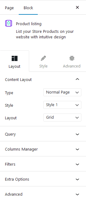
Let’s keep the listing to the Normal Page option.
From the Style section, you can select from different predefined styles.
Then from the Layout dropdown, you can select the layout of your product listing. Here you’ll find four options –
Grid – For showing products in a grid layout.
Masonry – For showing products in a masonry grid layout.
Metro – For showing products in a metro layout.
Carousel – For creating a product carousel.
Select the appropriate layout option which fits your need.
Query
From the Query tab, you can select category or tag as the source of your product listing and you can also include and exclude products by id. Here you’ll find four options –
Select Product Category – From here, you can select different product categories as the source.
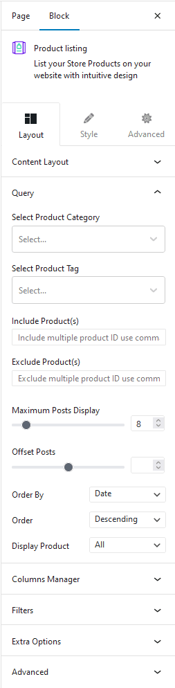
Select Product Tag – You can select different product tags as the source.
Note: You can use both categories and tags together as the source as well. In that case, a product must match both conditions to be included in the listing.
Include Product(s) – From here, you can include products by product id.
Exclude Product(s) – From here, you can exclude products by product id.
Note: You can use product category, tag, include and exclude products together but make sure the product IDs used are from the selected categories and tags.
Note: Select product category, select product tag, include and exclude options are only available with the Normal Page listing type.
In the Maximum Posts Display field, you can set a maximum number of products to be displayed on a page.
From the Offset Posts field, you can hide products from the beginning of the product list.
Then from the Order By dropdown, you can order the products. Here you’ll find multiple options –
- Author – With this, you can order the products by author name.
- Title – With this, you can order the products by title (alphabetical order).
- Date – With this, you can order the products by date.
- Modified – With this, you can order the products based on the last modified date.
- Random – This will show products in random order. So every time pages load, the products will show in a different order.
Then from the Order dropdown, you can arrange the products in ascending or descending order based on the option selected in the Order By dropdown.
From the Display Product dropdown, you can show products based on various statuses. Here you’ll find multiple options –
- All – With this, you can show all the products.
- Recent – With this, you can show the latest products.
- Featured – With this, you can show featured products only.
- On Sale – With this, you can show the products on sale, i.e. selling at discounted prices.
- Top Rated – With this, you can arrange products by rating.
- Top Sales – With this, you can arrange products by number of sales.
- Instock – With this, you can only show products that are in stock.
- Outofstock – With this, you can only show products that are out of stock.
Columns Manager
From the Columns Manager tab, you can manage the number of columns of your products for different devices.
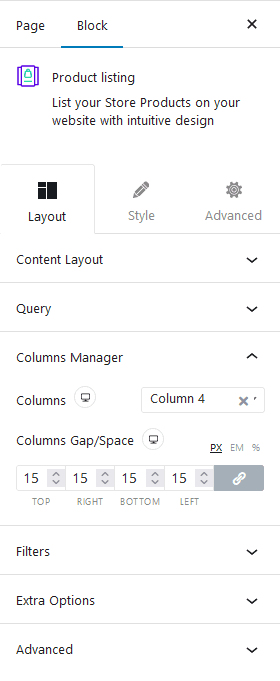
You can also manage the column gap from here.
For the Metro layout, you can also select different styles for each device.
Filters
From this tab, you can add a beautiful filter based on category or tag for your product listing.
Note: Filters option is only available in the Normal Page listing type, except in the Carousel layout.
Extra Options
In the Extra Options tab, you’ll find some powerful options.
Title Tag – From here, you can set different HTML tags to your product title.
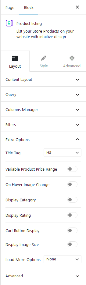
Variable Product Price Range – From here, you show the variable product price range.
On Hover Image Change – If you have multiple images for a product, you can show different images on hover from here.
Display Category – From here, you can show product category names on products.
Display Rating – From here, you can show product ratings on products.
Cart Button Display – From here, you can show or hide add to cart button from products.
Display Image Size – From here, you can select different product image sizes.
Load More Options – From here, you can add different types of options to load more products (not available in the Carousel layout). Here you’ll find three options –
- None – With this option, only a fixed number of products will be visible.
- Pagination – With this, you can add pagination to your product listing.
- Load more – With this, you can add a load more button to load more products.
- Lazy Load – With this option, you can add an infinite loading option to your product listing as the user scrolls down.
How to Style the Product Listing Block?
To style the Product Listing block, you’ll find all the styling options under the Style tab.
Title – From here, you can manage the product title typography and color.
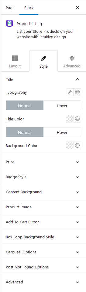
Price – From here, you can manage the margin, typography, and product price color.
Badge Style – From here, you can show or hide different badges like Out of Stock, Sale and manage their typography, color, background etc.
Content Background – From here, you can manage the product content alignment, padding, background and box shadow for both normal and hover state.
Product Image – From here, you can manage the product image border radius, background and box shadow for both normal and hover state.
Add To Cart Button – From here, manage the add to cart button padding, typography, color, background etc.
Box Loop Background Style – From here, you can add padding, border, background and box shadow to each product item in the listing.
Filter Category – If you’ve enabled Category Wise Filter then you’ll see this option. From here, you can manage the filter padding, margin, color and filter counter’s color, background etc.
Carousel Options – This option will be visible when you use the Carousel layout. Here you’ll find many options to control the carousel.
- Slider Mode – From here, you can choose your slider orientation, Horizontal or Vertical.
- Slide Speed – Control your slide transition speed from here.
- Active Slide – From here, you can select any slide to be the active slide when the page loads.
- Next Previous – You can set the behaviour of your next/previous slide movement from here. You can move one column at a time or all visible columns.
- Columns Gap – From here, you can adjust the gap of your slider.
- Draggable – Make your carousel draggable or non-draggable from here.
- Infinite Mode – From here, you can turn your carousel into an infinite loop slider.
- Pause On Hover – Allow the users to pause the slider on mouse hover.
- Autoplay – Make your carousel slider autoplay from here and adjust its speed.
- Show Dots – From here, you can add dots slider navigation and style them.
- Show Arrow – You can also add arrows navigation for your carousel slider and style them from here.
- Center Mode – From here, you can highlight the center slide by adding padding, scale effect or opacity.
- Wheel Navigation – With this option, you can navigate the slider with your mouse wheel.
- Keyboard Navigation – With this option, you can navigate the slider with your keyboard.
- Auto Scroll – With this option, you can make the slider auto scroll.
Note: For Auto scroll to work, make sure to disable Autoplay. This feature only works in the front end, you won’t see any preview in the backend.
Pagination – If you have selected Pagination from Load More Options, then you’ll see this option. From here, you can manage the typography, text color and hover color.
Load More Button – If you have selected Load More from Load More Options, then you’ll see this option. From here, you can manage the button typography, color, button background, border etc.
Lazy Load – If you have selected Lazy Load from Load More Options, then you’ll see this option. From here, you can manage all post loaded text typography, color, spinner size, border size and color.
Advanced – This is our global extension available for all our blocks. From here you can add a custom CSS class in the Additional CSS class(es) field. If you know CSS you can use this class to further finetune the style by using your own custom CSS.
Advanced options remain common for all our blocks, you can explore all it options from here.